Brooklyn Nets release new court design; hint at new Coogi jerseys
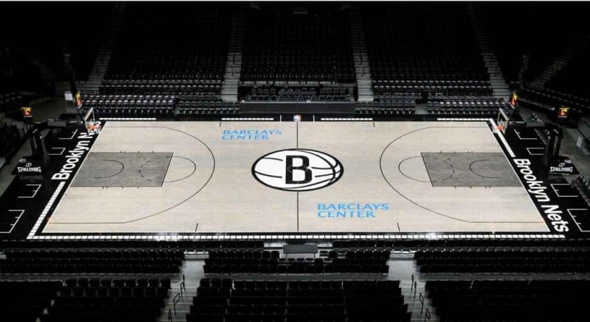
The Brooklyn Nets unveiled a new home floor design on Monday, and ESPN’s Zach Lowe hinted at new Coogi-styled jerseys.
[sc name=”Matt Brooks Banner” ]After capping off the greatest offseason in franchise history, in which the Nets churned years of losing into the talents of Kevin Durant and Kyrie Irving, the Brooklyn Nets are officially entering a new era. To commemorate the big summer, it appears Brooklyn’s front office is diving into a rebrand of sorts, starting with a new home floor.
Now look, I hate to be the one to say, “I told you so,” but… I forwarned you that the leaked 2K20 floor design might have some merit to it.
Courtesy of the Brooklyn Nets’ official Twitter account, a promotional video of the new home floor was released, which included artsy shots and clips of its construction.
Inspired by the borough. Built for the borough.
Introducing our first fully redesigned court of the Brooklyn era 🎥 pic.twitter.com/NKilJhu9u0
— Brooklyn Nets (@BrooklynNets) September 23, 2019
Like many things in the Sean Marks era, its rollout was carefully crafted from a marketing perspective; a press release from ESPN‘s own, Zach Lowe, also dropped this morning. Lowe, who has always had an affinity for court designs, included ample details about the process in creating the new home floor.
Lowe briefly touched upon the Nets’ former court design. Said Lowe, Brooklyn’s minimalist black-and-white flooring was a top-5 look among all 30 teams according to various polls. Because of this, team executives initially resisted the idea of refreshing the look. VP of Brooklyn’s content and creative team, Jeff Gamble, had this to say…
“We were nervous about messing it up. We have seen court designs that have fallen on their face.”
According to Lowe, it was Sean Marks who originally wanted the big change. He suggested grey flooring to represent the “industrial vibe” of the blacktop courts found across Brooklyn. One can only assume that by emulating Brooklyn’s community, Marks is making a concerted effort to connect with young hoopers across the borough, who may or may not have affiliations with any of New York’s professional teams. Resonating with the youth could be the key that unlocks a new future for the Nets, with a filled arena and dedicated fans in a near surplus.
Lowe pointed out that no other team had toyed with an all-grey alignment. He mentioned that one specific team (kept anonymous) proposed the idea of a black design years ago. Apparently, the league office rejected it due to concerns with poor viewing experience on television.
Marks’ idea of the grey court, however, was almost immediately accepted by Adam Silver’s brigade. This, of course, occurred after months of tinkering before ultimately settling on that signature two-tone greyish-tan.
[sc name=”Nets Center”]An exciting subplot for loyal Nets’ fans: the subway tiles are back! In 2015, the Nets unveiled a creative court design with the words “Brooklyn Nets” written out in a mosaic print on both baselines as a homage to New York City’s subway system. Unfortunately, last summer, Brooklyn’s front office made the decision to scrap this design to the chagrin of many fans.
Jeff Gamble mentioned that the front office realized they had made a mistake in pulling the tile flooring, “the subway design really resonated. We got a couple of eyebrow raises. We nodded along at that. We felt like we had made a change for the sake of change. We could have handled it better.”
Now, those tiles are back, in a more creative format than ever. Lowe unloaded details galore on the new subway-influenced design:
“The subway tiles are back, and much more visible on television — around most of the boundaries — than they were in the old mosaic version. The Helvetica font of the ‘Brooklyn Nets’ wordmark matches what the Metropolitan Transportation Authority uses on subway signs.”
The last major change occurred at the center of it all: the jump circle. Previously, Brooklyn’s center-court featured the words, “Brooklyn, New York.” Now, it features a giant letter “B” encapsulated in a basketball logo. According to Lowe, Marks loved the simplicity of it, hinting that the center-court insignia could be Brooklyn’s primary new logo. Marks told Lowe, “you are going to see that on a lot of merchandise this year.”
Sweet, I need a new Nets hat!
Brooklyn’s new era will be ushered-in the second the ball is tipped to new point guard Kyrie Irving at center-court; symbolically speaking, its fresh merchandise with that same center-court logo will reflect the major change.
Hidden away at the end of Lowe’s phenomenal piece, the senior writer mentioned that the team will unveil a Notorious B.I.G. version of the home floor at some point during the upcoming season. More importantly, the home floor will coincide with the release of new Coogi jerseys, this time with a base color of white.
Courtesy of Nets’ fanatic and notable merchandise designer, Flatbush and Atlantic, here is a mock-up of the soon-to-be offered white Coogi jerseys.
White Coogi 🔥🔥 https://t.co/j9ZuGjUj65 pic.twitter.com/1mAG4LzouV
— Mike King (@MikeKing00) September 23, 2019
Keep in mind, this is nothing more than a fan-generated design. Still, if the new Nets threads come out looking this fuego, expect them to fly off shelves. Shoot, I might need to start offering my content on Patreon to afford one …
A new era is upon us. Credit to Sean Marks. Exciting times are ahead.
[sc name=”Nets Link Next” link=”https://elitesportsny.com/2019/09/23/brooklyn-nets-news-multiple-players-land-on-espns-top-100-list/” text=”Multiple Brooklyn Nets Land On ESPN’s top-100 NBA Players List” ]
An NBA fanatic who specializes in the advanced analytics of the game. I cover the Brooklyn Nets here in the city. Follow me on Twitter for semi-witty basketball tweets. @MattBrooksNBA