New Jersey Devils: Finally, a sweater concept worth considering
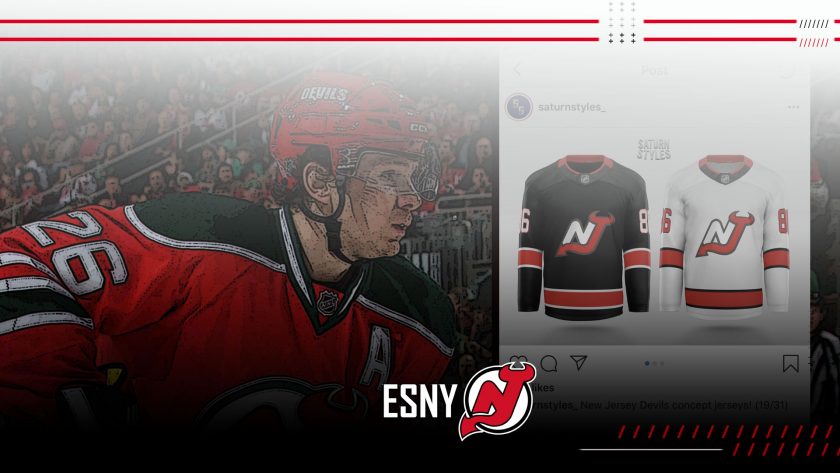
Saturn Styles created New Jersey Devils concept jerseys that are sparking serious interest with fans of Jersey’s team.
There’s a strong possibility that the New Jersey Devils experience almost a full calendar year without playing in a regular-season game.
The NHL’s 2020-21 campaign potentially beginning in January leaves Jersey’s faithful with plenty of time to overthink, speculate, and also discuss a long-awaited alternate jersey.
no, next NHL season will be delayed, bettman confirmed again yesterday. Next season won't start until November or December or maybe even January, he said yesterday. Because 2020-21 needs fans in the stands (gate revenue)
— Pierre LeBrun (@PierreVLeBrun) May 27, 2020
A jersey designer took that conversation one step further after posting concept sweaters for the Devils via Instagram on Sunday.
The hockey community’s reactions to Saturn Styles’ concept designs were positive more times than not, and fans can wonder if New Jersey will consider a similar layout for an alternate jersey in the future.
https://www.instagram.com/p/CA3yvuKgKUU/
It seemed that a majority of fans appreciated a black-based jersey, which isn’t surprising.
While utilizing a black third jersey might seem beyond overdone at this point, the concept does fit the Devils considering their color scheme – it’s not like the New York Rangers introducing a black alternate.
The two sleek jerseys stood out, but the eye-catching aspect from the post wasn’t the overall designs.
The primary crest is a nod to the team’s history and it’s a unique idea compared to most other concept designs fans will see littered across social media. The logo may not appear familiar to a younger generation of Devils fans, but it’s the original logo that was unveiled back in 1982.
Unlike the logo all fans have been familiar with since New Jersey took to the ice back in 1982-83, the “N” and “J” aren’t morphed together, per se.
The logo on these concept jerseys still portrays a simple and classic look, and technically it’s the closest thing to a secondary logo the Devils have ever had. Keep in mind the logo was never actually utilized or marketed.
This hockey jersey enthusiast actually likes the idea of utilizing the throwback logo and incorporating it on a black alternate jersey. However, adding both green and white to border the logo on the sweater may not be a bad touch and really make the sweater stand out for the better.
Whether fans like it or not, the Devils stick to tradition and it’s been a strength of New Jersey’s brand for decades. Re-introducing this logo on a black sweater still holds that traditional appearance while hinting a modern style in the process.
Let’s not forget about the white sweater, though. The chances are the white version from this concept designer is a long shot. The piping located on jersey’s sleeves and base are a clean look, but it’s also borderline identical to Team Canada’s jerseys from the 2002 Winter Olympics and a current foe in the Carolina Hurricanes.
Ranking Canada's Olympic hockey teams from 1998 to 2014 https://t.co/Ga29fM0opb pic.twitter.com/RDZO102d4R
— theScore NHL (@theScoreNHL) April 29, 2020
Would you want to see the Devils incorporate this logo for a future alternate sweater?

Kyle McKenna is a freelancer who covers the NHL for Elite Sports New York, Hooked On Hockey Magazine & Fansided.
Follow him on Twitter @KMcKenna_tLT5 and use the hashtag #McKennasDigest to have your NHL questions featured in an article or answered over his weekly NHL podcast.