The evolution of the New York Rangers magnificent uniform
ESNY travels down memory lane by examining the evolution of the New York Rangers magnificent uniform over time.
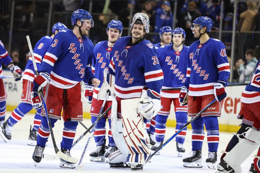
Look at any “top NHL jerseys” list. You will find the New York Rangers sweater near the top on just about all of them. It’s easy to see why. The Broadway Blueshirts’ uniform is simple, but classic. With diagonal letters stitched across the front spelling “Rangers,” red, white and blue stripes on the sleeves and bottom, and a drop shadow on the letters and numbers, this jersey is iconic.
Now, the Ranger jersey remains mostly the same since the team first came in the league. However, there are still times where it was tweaked or even changed completely. Some of these changes received warm welcomes from the Garden Faithful. Others made fans unhappy, thinking the team fixed something that wasn’t broken.
There is a lot to cover in the team’s 93-year history. So, here is the evolution of the New York Rangers uniform.
1926: An icon is born
(Source: http://www.nhluniforms.com)
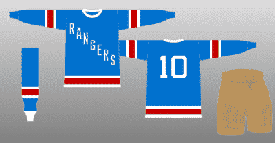
In 1926, the New York Rangers were born. They come into the league as an expansion franchise, joining the New York Americans as the second team at Madison Square Garden. The Rangers got their name after their first owner and Garden president, George “Tex” Rickard because sportswriters were referring to them as “Tex’s Rangers.” So, yes, the Rangers name was born from a pun.
So Rickard adopted the name and gave it to the Rangers. Rickard wanted the Rangers to stand apart from their cross arena rivals. The Americans uniform, obviously, had a red, white and blue, stars and stripes pattern, with their name stitched horizontally. So in order to make the Rangers stand out, Rickard gave them a blue, white and red jersey with the team named stitched diagonally across the front.
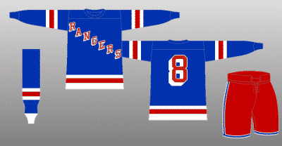
The jersey has almost the same color pattern it has today. It was blue, with white and red stripes on the sleeves and bottom. The font of the word “Rangers” is almost the same as the font of the Winter Classic jersey the Blueshirts wore against the Buffalo Sabres at Citi Field on New Years Day, 2018.
Dawned by Hockey Hall of Famers like Bill Cook and Lester Patrick, the Rangers wore this jersey when they won their first Stanley Cup in just their second season (1927-28). It did go through some tweaks in it’s first few seasons, mostly with the name across the front and the number on the back. It went from white, then red, then red with the white border as we know it today.
1929: A little more familiar
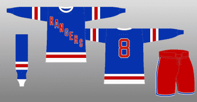
In 1929, the Rangers changed to a darker shade of blue that they still use to this day and even changed their pants from brown to red. When the Rangers won their second Stanley Cup in 1933, they dawned this jersey while they accomplished that feat.
In 1937, while the jersey was kept the same, the pants got a blue stripe with the white outline, similar to how the team wears them now. The Rangers wore this uniform when the team won their third Stanley Cup in 1940.
1941: New font
Entering the 1941 season, the Rangers changed the wordmark of their sweater. Starting the next season, the word “Rangers,” as well as the number on the back, got a white drop shadow which gives it somewhat of a three-dimensional feel. This feature is now synonymous with the Ranger jersey and is still part of it now.
However, starting the next year, the drop shadow disappeared from the letters and numbers. The red pants also got a couple more blue and white stripes added to it, giving them the color and stripe pattern they have now.
Then in 1946, the Rangers had almost a complete change of identity.
1946: Well, this is different

Yes, this was a real uniform that the Rangers wore. The Blueshirts drop their iconic diagonal lettering, for horizontal lettering and a number on the front. Almost like a basketball jersey.
Rickard, who passed away in 1929, initially gave them the diagonal lettering to help the team look different from the New York Americans. At this point, the Americans were out of the picture.
This jersey isn’t ugly, but it isn’t what you think of when you think of the Rangers. The fans must have rejected it pretty hard because the following season, the Rangers went back to the 1942 designs. In the seasons following, other than some very minor tweaks to the lettering (smaller wordmark and the letters straightened a bit), the Ranger jersey stayed like that.
1951: That makes two

In the 1950s, the NHL made it a rule that each club have two jerseys. The Rangers added their white sweater in 1951. The lettering and number on the back went from red lettering with a white outline, to blue lettering with a red outline. However, rather than just be a total reverse of the blue sweater, the white sweater has a red collar and blue shoulders with some red, white and blue stripes thrown in the mix. Also added to the jersey were laces near the collar.
From this point forward, the Rangers continued to not mess with changing the design of their iconic sweater. Only additions to the jersey from that point were the numbers on the sleeves in 1963 and players names to the white jersey in 1970. Then, just like in 1946, they put forth a drastic change in appearance.
1976: New York Jets or Winnipeg Rangers?
Think of this jersey as the Rangers equivalent to when the New York Islanders switched to the fisherman uniforms. For the second time in their history, the Rangers ditched their iconic diagonal lettering for a new design. This time, for a more modern approach under the direction of general manager John Ferguson.
The Rangers replaced the diagonal lettering with their main logo on the front of the jersey. The stripe pattern on the sleeves, shoulders and bottom also changed. The number was changed to a generic font with no outline or drop shadow behind it. Not even the pants were safe, they were changed from red to blue.
However, one slight change to this jersey came in 1977: players names were added to the away ones too.
This jersey only lasted two seasons. Ferguson was fired after the 1977-78 season. In 1979, when Ferguson became the GM of the Winnipeg Jets, he took this jersey design with him.
1978: back to normal, for the most part
After fans rejected Ferguson’s jerseys, the team went back to their bread and butter. However, it too came with some changes. The blue sweater no longer said “Rangers.” It said, “New York.” The away jerseys had “New York” stitched diagonally across until 1987 when it was changed back to “Rangers.”
Also ditched from the sweater were the laces on the collar, but those were vanquished when the Ferguson jerseys came into existence.
The stripe pattern on the sleeves and bottom of the blue sweater also had two blue stripes added in between the white and red.

In 1990, the player name on the back of the jersey went from being straight to being on a vertical arch. Of course, these are the jerseys the Rangers donned when Mark Messier and company broke the 54-year Stanley Cup drought in 1994. Both jerseys remained like this until 1997. But in 1996, for the first time in their history, the Rangers added a third jersey.
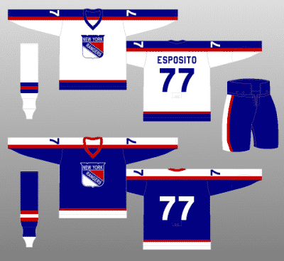
1996: Lady Liberty joins the party
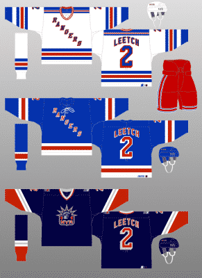
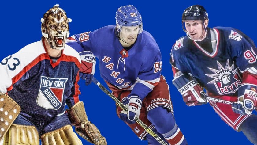
In 1996, the Rangers introduced a third jersey to their uniform lineup. This new sweater featured a brand new logo from GM Neil Smith after some inspiration from Mike Richter‘s helmet design. The new logo featured the Statue of Liberty’s head on a shield with the letters NYR underneath her.
The jersey was navy blue with a different stripe pattern of red, white and even silver thrown into the mix. The next year, the jersey changed to white for one season before turning back into a navy blue sweater. This jersey was highly popular among fans and was the Blueshirts third sweater until it was retired in 2007 when the NHL switched to Reebok as the jersey manufacturer.
On the Rangers main blue jerseys, the team went back to its original stripe pattern in 1997. Gone was the blue stripes in between the white and red stripes on the sleeves and bottom. Also brought back were the collar laces on the main home and away jerseys.
Despite the NHL changing jersey manufacturers twice so far in the 21st century, the design of Rangers jersey stays like this to this day.
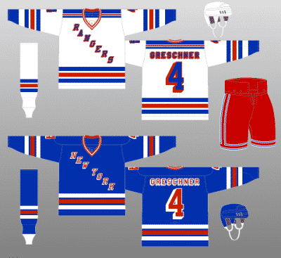
2010, a celebration of heritage
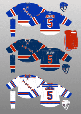
Three years after the Liberty jerseys were discontinued, the Blueshirts added a new third sweater in 2010. These jerseys were dubbed the “Heritage” jerseys. The Rangers introduced these sweaters during the 2010-11 season in celebration of the clubs 85th anniversary.
Like the Liberty jerseys, this sweater is navy blue. But unlike the Liberty jerseys, these ones feature the Rangers original stripe pattern. The classic diagonal wording on front reads “New York” instead of “Rangers.” The jersey also substitutes white with a cream color to give it that retro feel. The Blueshirts donned this jersey mostly during home matchups against Original Six teams. The jersey lasted up until the 2016-17 season when the NHL switched to Adidas.
[sc name=”Rangers Center” ]What can we expect in a new third jersey?
The Rangers jersey is classic for a reason. To this day, they are still the only NHL team not to feature their main logo on their sweater. This look stood the test of time for nearly a century and it is not going away anytime soon.
Of course, every once in awhile, they put on something different. There are the Winter Classic jerseys from 2012, the Stadium Series jerseys of 2014, and the Winter Classic jerseys from 2018. These jerseys do have their place in the hearts of Ranger fans everywhere. However, they can never replace that simple look that the team used since 1926.
While fans certainly don’t want the main jerseys to change, it’s safe to assume a third jersey would be welcomed as long as it looks good. The team hasn’t announced a third uniform yet, but when the time comes, what will it be?
Do they go back to the statue of liberty logo that worked for over a decade? Do they go back to the heritage jerseys that were working until the NHL switched jersey manufacturers? Maybe they can even do a throwback to the “Winnipeg” jerseys from 1976-78. Hey, if Isles fans can get over the “Fishstick” uniforms, then maybe Ferguson’s jerseys can grow on Ranger fans. That is, of course, as long as it remains the third jersey and nothing more.
Maybe it’s none of the past designs. Maybe they will come up with something completely original for a new third jersey. Again, fans will welcome it as long as it looks good.
Whenever this happens, one thing remains certain: the current Rangers jerseys are classic and are here to stay. It’s been a part of the team’s identity for almost a century and the fans have shown they love it. As long as the New York Rangers and the NHL exist, the Blueshirts’ sweaters are probably going to remain this way until the end of time.
[sc name=”Rangers Link Next” link=”https://elitesportsny.com/2019/07/18/new-york-rangers-fans-voice-what-they-think-next-step-should-be/” text=”Rangers Fans Voice What The Next Step Should Be” ]
WPU Graduate. Die-hard Ranger fan. Pain loving Jet fan. Loves to make comic, movie and TV references. Born and raised in Central Jersey.
Twitter @JohnnyLonny82
Instagram @JackKnife82