
Fresh season. Fresh @NJDevils sweater. Excited to welcome the newest Devil to Jersey on Friday night! #DevilsDraft pic.twitter.com/9fUXVflOHJ
— Taylor Hall (@hallsy09) June 21, 2017
It’s still Red, White and Black but they the new Adidas New Jersey Devils uniforms for 2017-18 look sweet.
Former New Jersey Devils general manager Lou Lamoriello once said that he loved the Devils’ jerseys just the way they were. The logo was never to change and the stripes were never to move too far away from where they started in 1982.
Now, with Lou Lamoriello out of office and Adidas taking over as the uniform provider for the NHL, the New “New Jersey” Jersey has finally been altered … for the better. The logo hasn’t changed and it probably never will, but there is so much more than just the crest that can make or break the slickness of a hockey jersey.
Like the logo, the colors remained the same as well. The only team that got a firm recoloring was the Edmonton Oilers, who now are sporting a paler orange, that gives off a bit more ferocity than the bright neon. On to what has truly changed about the Devils uniform …
Heritage. Performance. Progress.
Learn more about the #NJDevils new sweater: https://t.co/z4fFdFUtZd pic.twitter.com/c9MNlPrCyx
— New Jersey Devils (@NJDevils) June 21, 2017
The Devils old jerseys had thick stripes that went all the around just above the bottom of the jersey. A thin white stripe, followed by a thick black striped, finished off by an identical think white stripe. The same pattern existed on the arms of the jersey as well. Now, the striped on the bottom have disappeared. There isn’t one where the stripes used to be. However, there is a thin strip of black that lines the bottom of the jersey. It looks slick.
As for the arms, the stripes remain the same, in the same order of white, red, white. The difference is, the stripes are all of equal thickness, consuming just a bit more of the sleeve than it used to. The subtle change pays homage to the Devils former location, the Colorado Rockies, where there were three even stripes of yellow, red, yellow. It’s a good thing Adidas decided to keep the yellow out of the picture.
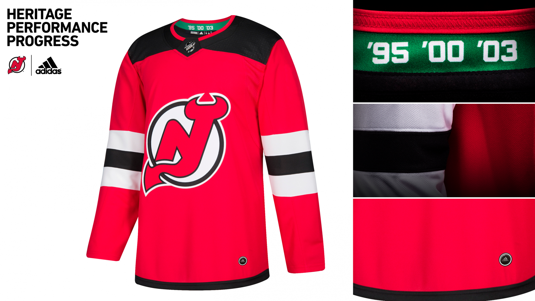
The coolest part of the Devils new jersey is the inside of the collar, which sports a green stripe, tribute of course to the Christmas jerseys the Devils wore shamefully for their first decade of existence. On top of the green stripe is three numbers, ’95, ’00, and ’03. They represent none other than the three years Martin Brodeur, Scott Stevens, Scott Niedermayer and Sergei Brylin (the unloved fourth member) hoisted the Cup in New Jersey.
It seems that the reception of the “New Jersey” isn’t so hot. Some may agree to disagree, but by the time these uniforms hit the ice, fans will be buying them, without a doubt.
A quick side note … the Golden Knights jerseys are gnarly. The smoky grey compliments the gold and black beautifully. It can go without saying that no matter who the Golden Knights chose as their roster, those jerseys will be flying off the NHL Shop’s website, and off the walls at “the Armory,” the smartly titled name of the Golden Knights team store in Las Vegas.


